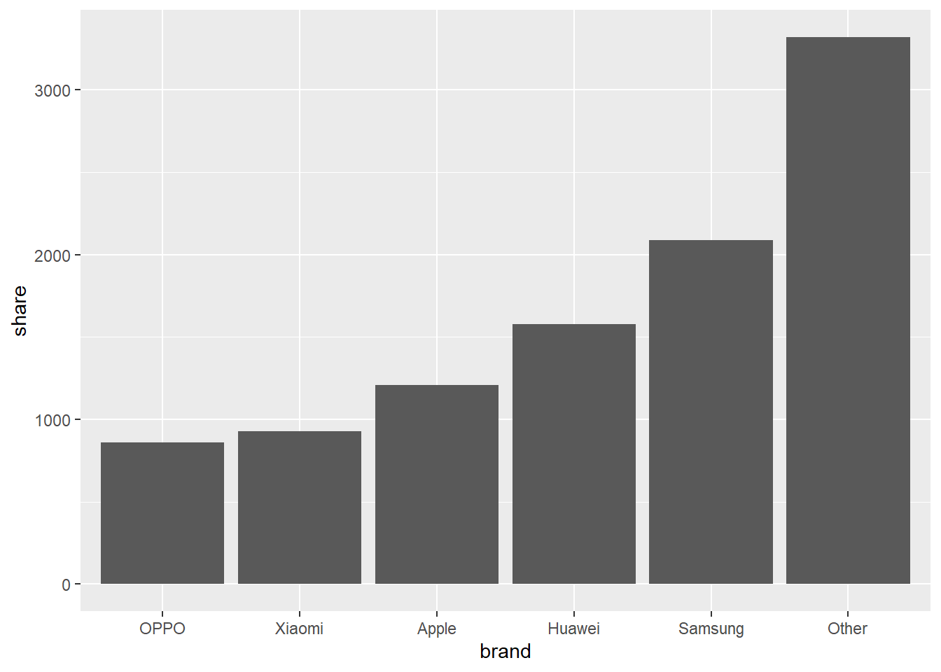
A chart featuring the interaction of a categorical variable and it’s numercial value. More simply, the numercial values are represented by bars, whose length vary based on the value
Bar chart is more preferrable than pie charts and mostly better choice to compare values.
When to use it?
When drawing comparison between different categorical variables.
When the discrete variables being represented are more than 4.
When not to use it?
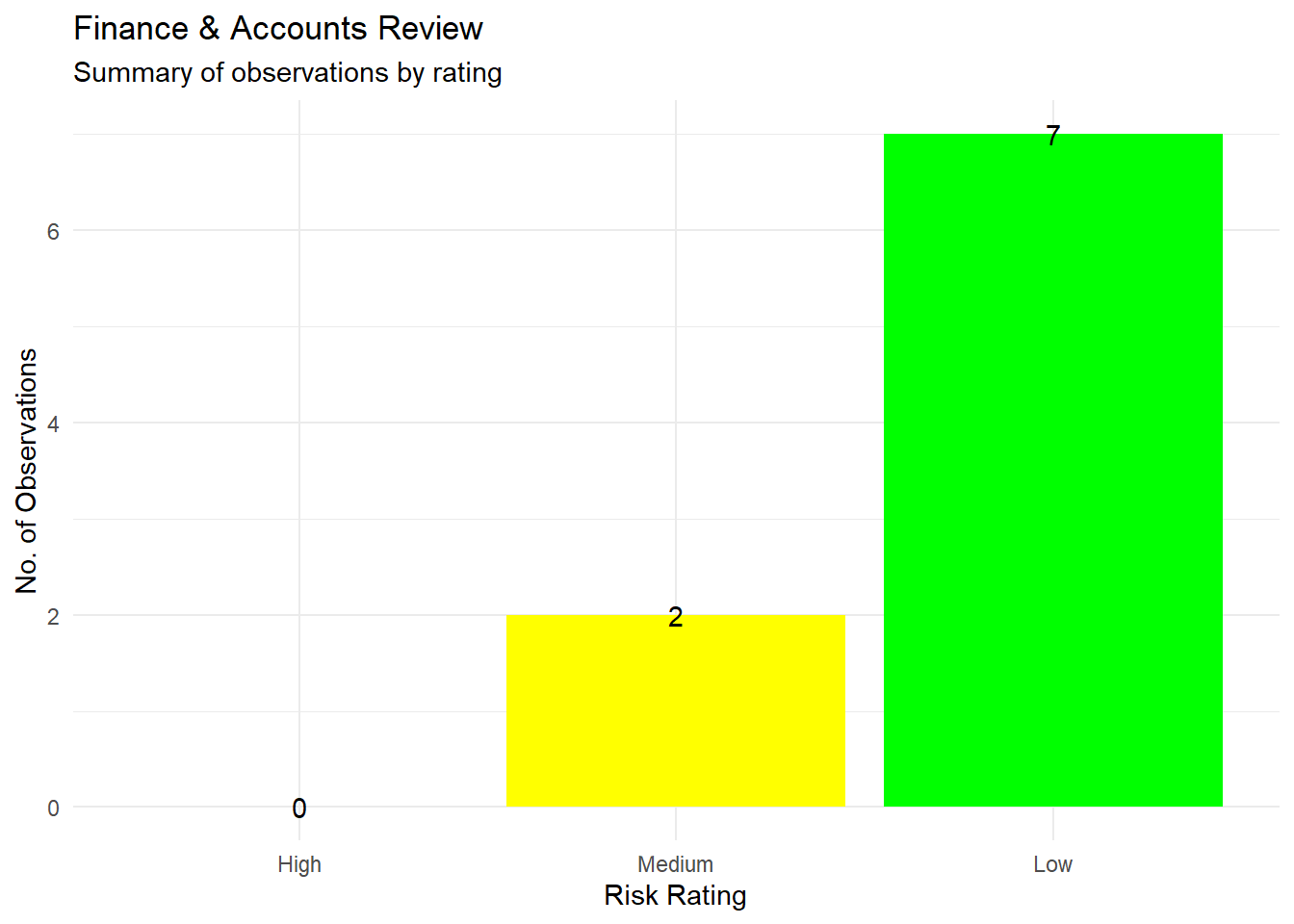
When the discrete variables being represented are greater than 5
When comparison of a discrete variable, having another another discrete variable is required
Hueristic of making a bar chart in R
In the ggplot, aesthetic function call,
x should be categorical variable. Use as.factor, in-case the variable is a numeric variable
y should be the numerical variable from the dataset.
Fill argument should be the categorical variable from dataset.
Call geom_bar() function, wherein stat = “identity”
Alterntively, geom_col() can also be used
Finally, set labels using the labs() functions call
Examples of making bar chart using ggplot2
library(tidyverse)
── Attaching core tidyverse packages ──────────────────────── tidyverse 2.0.0 ──
✔ dplyr     1.1.2     ✔ readr     2.1.4
✔ forcats   1.0.0     ✔ stringr   1.5.0
✔ ggplot2   3.4.2     ✔ tibble    3.2.1
✔ lubridate 1.9.2     ✔ tidyr     1.3.0
✔ purrr     1.0.1
── Conflicts ────────────────────────────────────────── tidyverse_conflicts() ──
✖ dplyr::filter() masks stats::filter()
✖ dplyr::lag()    masks stats::lag()
ℹ Use the conflicted package (<http://conflicted.r-lib.org/>) to force all conflicts to become errors